# tlohde

Croissant Distribution

Minimalistic map of France, showing a series of nested contour lines in blue and red. Blue contours represented the density of bakeries; red farms. Above the main plot, the longitudinal distribution of bakeries and farms are shown (with a prominent bakery mode inline with Paris), and to the right the latitudinal distributions. The map titled: Croissant Distribution (boulangerie & fermes), and is accompanied by the text: Spatial distribution* of bakeries and farms across France. *kernel density estimate. Image credits: by:tlohde. (C) OpenStreetMap contributors, Font: Borel by Rosalie Wagner. The font is nice and cursive
Croissant Distribution: Or, where am I most likely to have my next croissant, assuming (something something) independence from my previous croissant. 🥐^k * e^(-🥐) / k! See v1 here. This map has been given a place in the 2026 GeoHipster Calendar which can be purchased here.

projection UTM Zone 31N
tools Python libraries: osmnx, seaborn and matplotlib for plotting. Used jointplot with kind='kde'. Inkscape for labelling
data OpenStreetMap contributors
font Borel by Rosalie Wagner
comments 
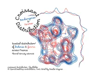
v3. of this idea. Pardon the way I have inadvertantly butchered the lovely cursive font by bending it around a circle such that there are now gaps between each character. Sorry. The choice to use a kernel density estimate is purely aesthetic, a straightforward contour plot, or heatmap would be more appropriate, and I did try these, even log-scaled, but the sheer number in Paris rendered the rest of country dull and empty by comparison. And this is another one that is effectively showing population density by another name.
date 02/09/2025