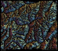
Brenta Flow
| projection | UTM Zone 33N |
|---|---|
| tools | Python libraries: geopandas, cartopy, xarray, shapely, shapelysmooth and matplotlib
|
| font | Deja Vu Sans Mono |
| comments | Best viewed on a large screen. The lines could perhaps be a little bit thinner. Also, my code for running this was very inefficient. I can't remember how many lines there are, but there are a lot (of the order of 50,000), and my code was only partially vectorized. The line smoothing taubin smoothing, helped make it look more flowly. Things to try: a grayscale/opacity circular colormap or incorporating a hillshade to really make the underlying terrain obvious |
| date | 20/01/2024 |